Revert to type – a brief overview of the TYPEWRITTEN series by Timglaset
I cannot recall how I first found out about the TYPEWRITTEN series, a collaboration between Plaugolt SatzWechsler (Rostock, Germany) and Timglaset Editions (Malmö, Sweden), but I do remember purchasing the publication, S ACE P by Amanda Hurtado. A forty-paged book consisting of a retyped chapter from Clark Coolidge’s SPACE, using an IBM Selectric Composer, the same machine used to set the original, enabling replication of layout and the unique Journal Roman font found in the 1970 edition.
An added abstracted layer is introduced by Hurtado through the separation of each word in accordance to touch-typing rules, letters typed with the left hand appearing on the left pages and those with the right on the right side, with spaces kept in words for the dislodged letter(s), illustrated in title.
A piece that works both visually and as a piece of constrained writing. The word space conjuring up typographical and conceptual associations, pulling things apart to reveal new patterns. The hand-crafted quality of the book resonates, a considered object to go with the rigorous nature of the project, Hurtado had to write a score for the entire book to ensure correct spacing units. I immediately decided to keep my eyes peeled for future releases.
The series, at the point of writing, now stands at seven. All unified by design, all markedly different in content. Printed by psw on a mimeograph Gestetner 320, these are tactile objects, the inclusion of the printer’s summary at the end of publications is a lovely touch, waxy overlayed pieces that are suggestive of the printing process but also function as abstract images to be considered. Each release has a distinct saddle stitched finish, executed by deft hand of the editor.
The subject of constraint in art is, paradoxically, seemingly unending, tightly prescribed limits can ultimately lead to a lifelong practice in which to operate within. What appear, at first glance, as narrow parameters lie infinite subtle variations. From Roman Opalka’s numerical paintings, beginning with the figure “1” in 1965 and every day after painting consecutive numbers. At the time of his death Opalka had reached 5,607,249, to the ‘Today series’ (1966 – 2014) by On Kawara with each painting made on the day it depicted; if not completed before midnight, the object was destroyed. Seen collectively the difference between each canvas – the format, colour, and the language of the country in which each painting was executed – is amplified.
The grids and stripes in Agnes Martin’s work shifted in scale and proportions from piece to piece, with forms evolving over many years. Sitting in the gap between painting and drawing, often utilising graphite, and coloured pencils on painted canvases, they demand close attention. When studied the variation in line, caused by irregularities encountered on the surfaces, come sharply into focus, as do the ghostly marks demarking each band, the slight shifts in tone and washes of colour.
The fifth book in the TYPWRITTEN series is abstract emotions by psw (Petra Schulze-Wollgast), it consists of fifteen minimalist typographics, each a homage to the work of Agnes Martin. On the Timglaset website it states “They delight in symmetry – and imperfection. Tightly controlled yet emotional, they preserve mistakes that may not be evident at first look. Like in Martin’s work the traces of the human hand are always present.”
When scrutinised acute differences appear in the drawings, these minor ‘mistakes’ and imperfections add to the work. Just as in Martin’s hand-drawn lines, the process of making is apparent, subtle changes in line and darker areas reveal different pressure applied to each key by the artist. Through repetition difference is revealed.
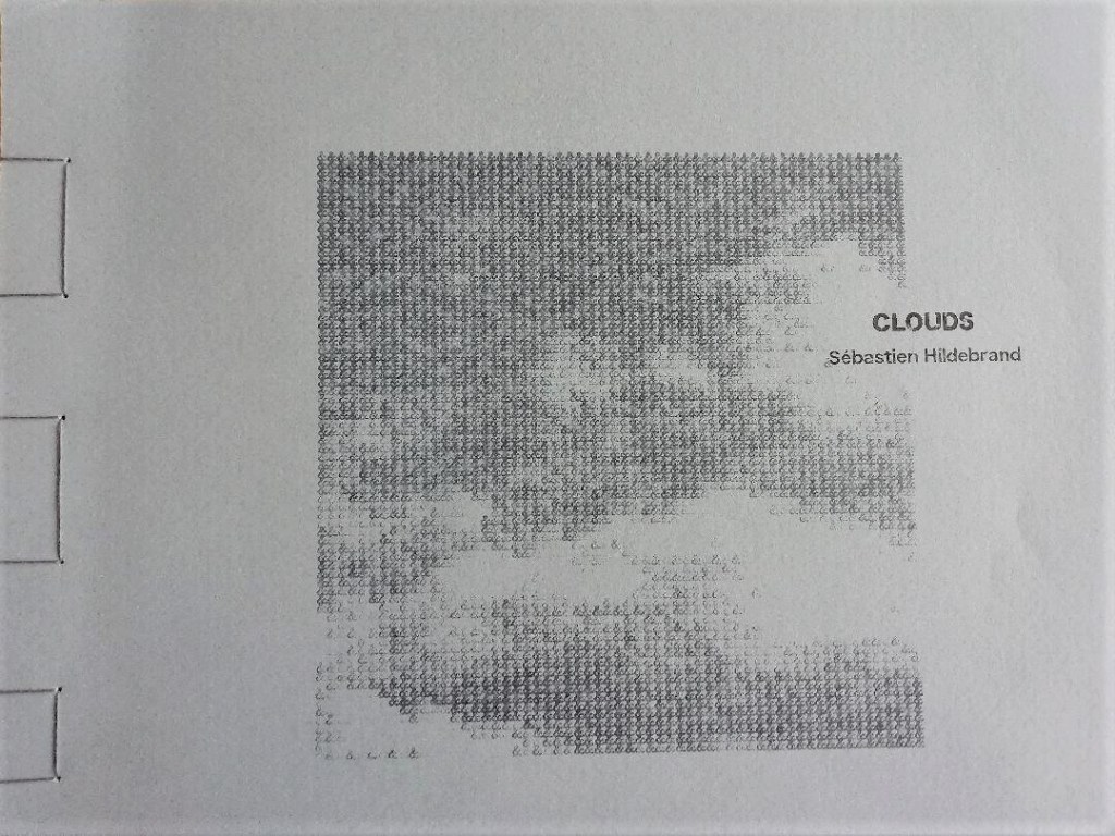
The latest release, Clouds by Sébastian Hildebrand, is unquestionably the most colourful of the collection, consisting of eight typewriter drawings all mimeographed in differing shades of blue, a short poem by Anthony Etherin, and five printer’s summaries, the final one of which I keep getting drawn back to, deeply dense tones, suggestive of a palimpsest of miniature Ad Reinhardt blue paintings.
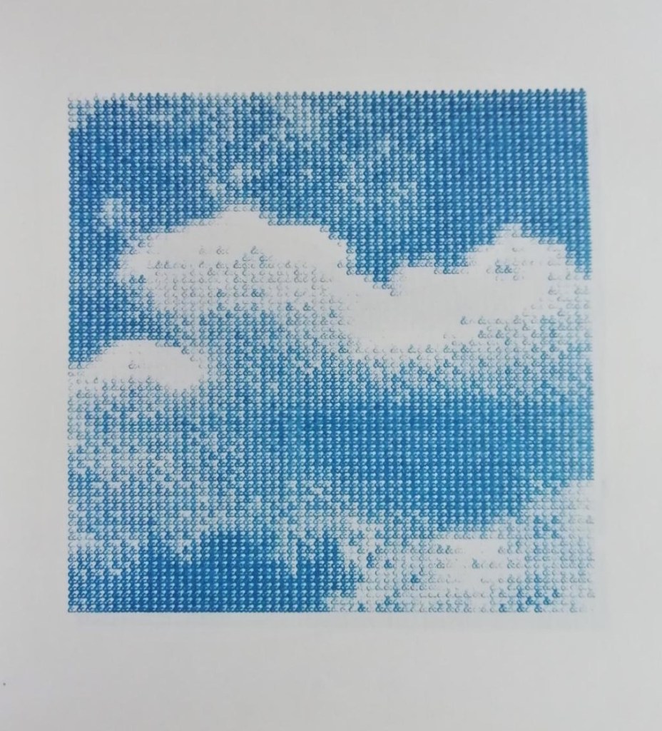
Hildebrand uses just one key on the typewriter, the ampersand, to create cloud drawings, although each one the same in scale, all again demonstrate variation within strict limitations. The sequential nature of these logogram images fit perfectly with the landscape format of the book. In the preface Hildebrand writes – “Today most of our data is stored in ‘intangible’ virtual clouds. The typed series ‘Clouds’ tries to reproduce the physical and temporal existence of these data, here symbolised by the sign Ampersand ‘&’ which is widely used in computer coding.”
Print runs in this series are short, with each edition limited to 45 copies, these handbound publications are being collected around the world, engaging an international readership. Timglaset has the feel of a seminal publisher of specialist artist books, 0-9 by Vito Acconci and Bernadette Mayer comes to mind, operating in the gap between the typed and the visual. Providing a much-needed platform for practitioners who continue to engage with, and develop upon, ideas raised by concrete poets and the numerous artists who utilised the typewriter as a creative tool.
Joe Devlin 01/02/2021
Below, a link to a piece I wrote for the Caught by the River site –
